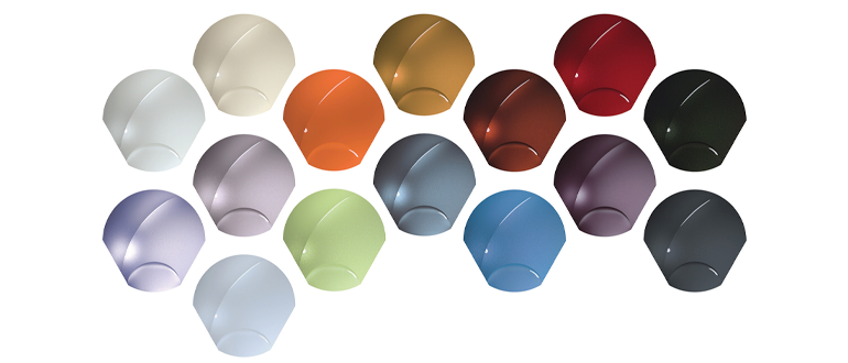
HOT SWATCHES
BASF releases 2021-2022 Automotive Colour Trends collection
By Max Reid
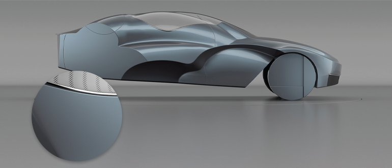
Societal change marked the theme for Asia Pacific’s BASF-dictated colour trends this year. Mobius, Asia Pacific’s key colour for 2022, offers a deep silver-blue hue designed to evoke innovation and “higher levels of understand in our diverse world,” said BASF.
Dust off your berets and furrow your brows—the BASF 2021- 2022 Automotive Colour Trends collection is here. The design experts at BASF’s Coatings division have delivered this year’s offering of colour commentary with the theme of SUPERPOSITION; what the company considers the “state where the limitation of binary systems is overcome,” according to the press release.
“These eye-opening and thought-provoking colours are a superposition of complex tones that challenge our perception.” – Mark Gutjahr, head of automotive colour design, EMEA
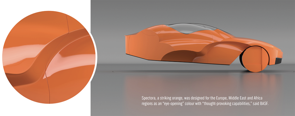
BASF says that this theme speaks to the inherent variation of the world, pushing past the scope of binaries like black and white. Colour trends in BASF’s Europe, Middle East and Africa sector led the company to develop Spectora, a shade of orange, as the most reflective of the market.
“These eye-opening and thought-provoking colours are a superposition of complex tones that challenge our perception,” said Mark Gutjahr, head of automotive colour design, EMEA.
When deciding on a colour reflective of the Asia Pacific market, BASF wanted to capture the societal change seen in the region through the use of “light” and “flexible” motifs, resulting in the blueish-silver Mobius shade.
“Asia Pacific’s key colours are light, clean shades evoking the exciting look of spring and the forward-looking hope it brings,” said Chiharu Matsuhara, head of automotive design for Asia Pacific. “They show a higher level of understanding of our diverse world.”
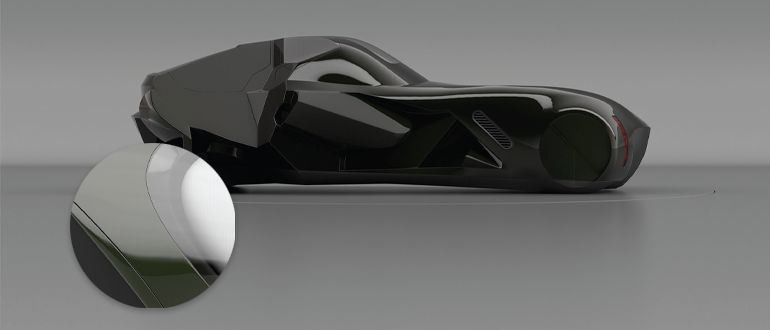
China’s key colour—Knowing Ignorance—appears almost black from a distance. In truth, this hue is a silverblack tone with notes of deep olive when viewed up-close.
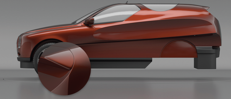
Lambent Earth, the key colour for the North American region, references the concept of balance, said BASF, and is meant to “strike a chord with human steadfastness.”
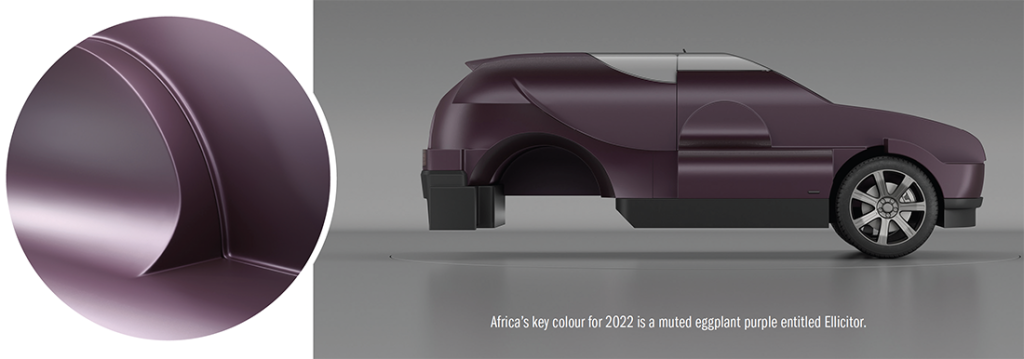

The shade chosen to represent the North American market is meant to reflect optimism and steadfastness, according to BASF, resulting in the burnt orange shade, Lambent Earth.
“We found the equilibrium between the natural and the synthetic world to create calming, unwavering, and thoughtprovoking colours. They draw the viewer into unique sensations that operate on multiple non-binary levels,” said Paul Czornij, head of automotive design for the Americas.

